Kathryn Rogers
Portfolio Site


Introductory project for Book Design course, with the purpose being to re-design covers for one classic novel and one contemporary novel. The stories were assigned at random, and it was highly encouraged to take separate styles for each cover: one with an illustration-centric style, and the other with more of an emphasis on typography.
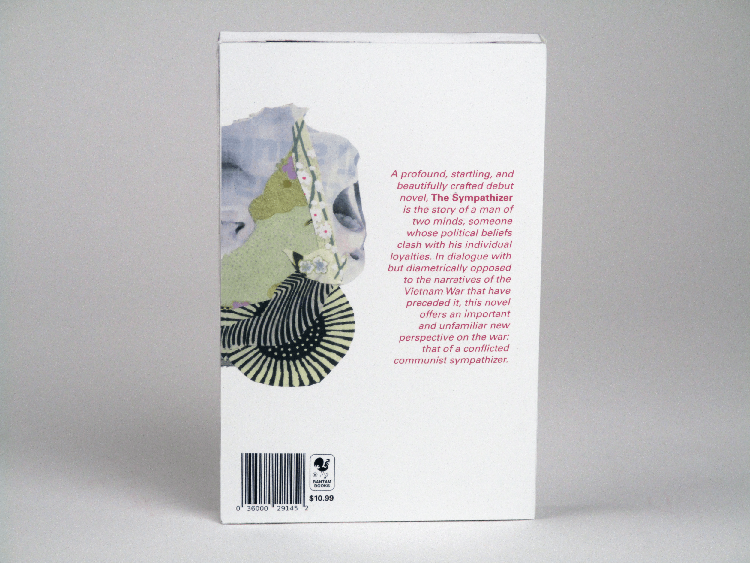
I wanted The Sympathizer to be my illustration-heavy cover, due to the story’s rich and unique visual symbols. I collaged this two-headed baby out of magazine spreads and a random assortment of paper samples.
I made The Great Gatsby, meanwhile, as my type-centric cover. I took inspiration from the Art Deco and Harlem Renaissance movements, and utilized the Franklin Gothic typeface, as all three elements were contemporary styles and fonts in the historical setting of the novel.